Amanda Ansonar is a nail and personal care brand born from the balance between technique and sensitivity: precision in every detail, and the calm of a ritual done well. Founded by Amanda, the project turns manicures into a warm, contemporary experience where the result matters just as much as the process. A space to switch off, take care of yourself, and leave with flawless hands—no excess, no rush, just intention.
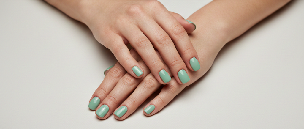
The offering brings together the essentials of a modern studio: clean, polished manicures, long-lasting gel finishes, minimalist designs, and creative touches that elevate the everyday. From soft tones and timeless combinations to fine details and custom sets, everything is guided by the same idea: real quality, impeccable hygiene, and a style that adapts to you. The service feels effortless and premium—honest guidance, carefully chosen products, and attention that prioritizes nail health.
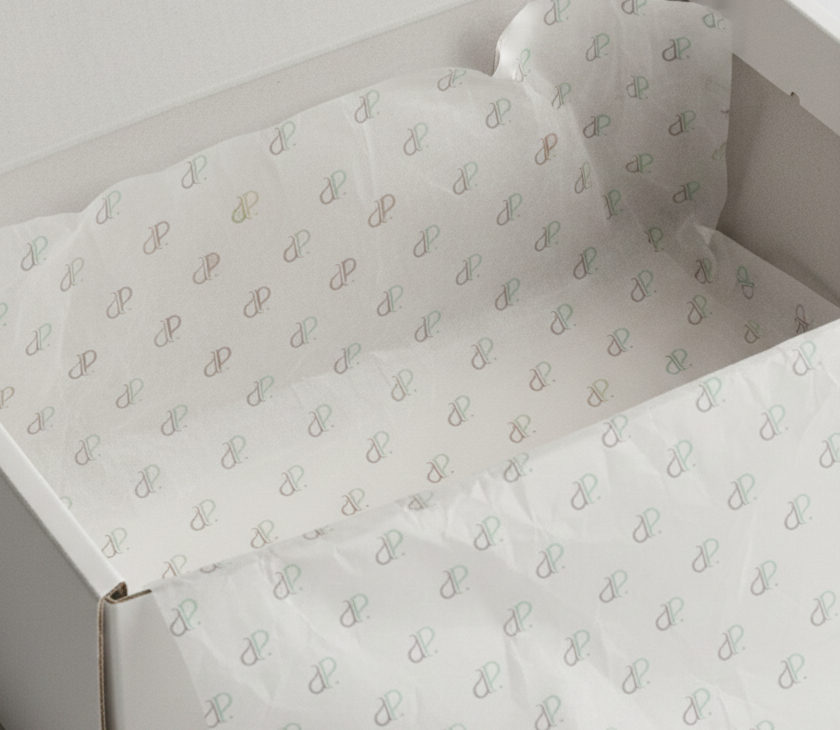
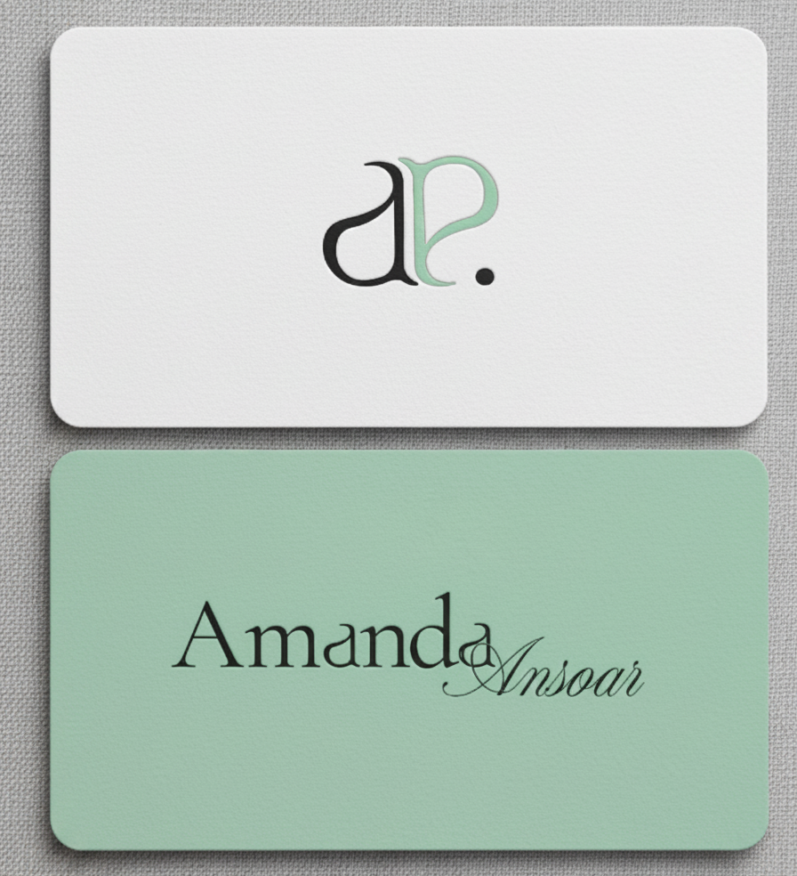
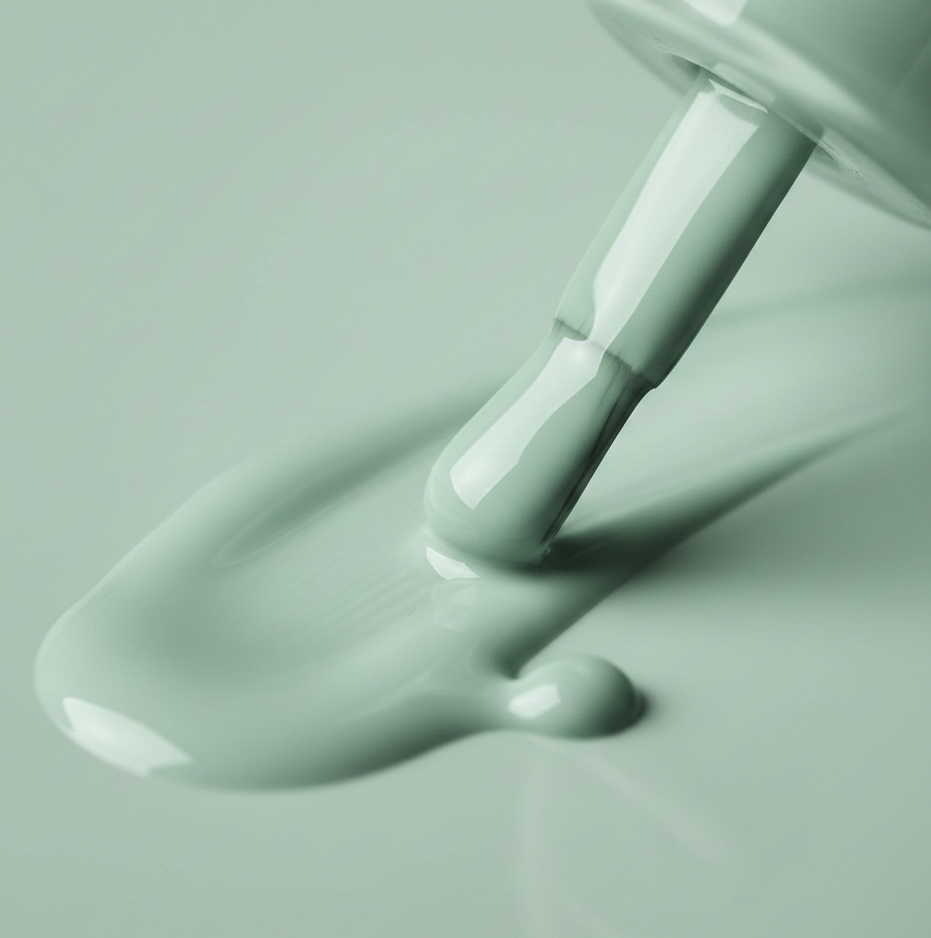
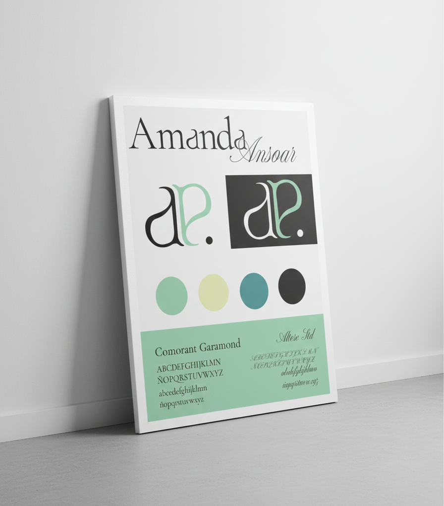
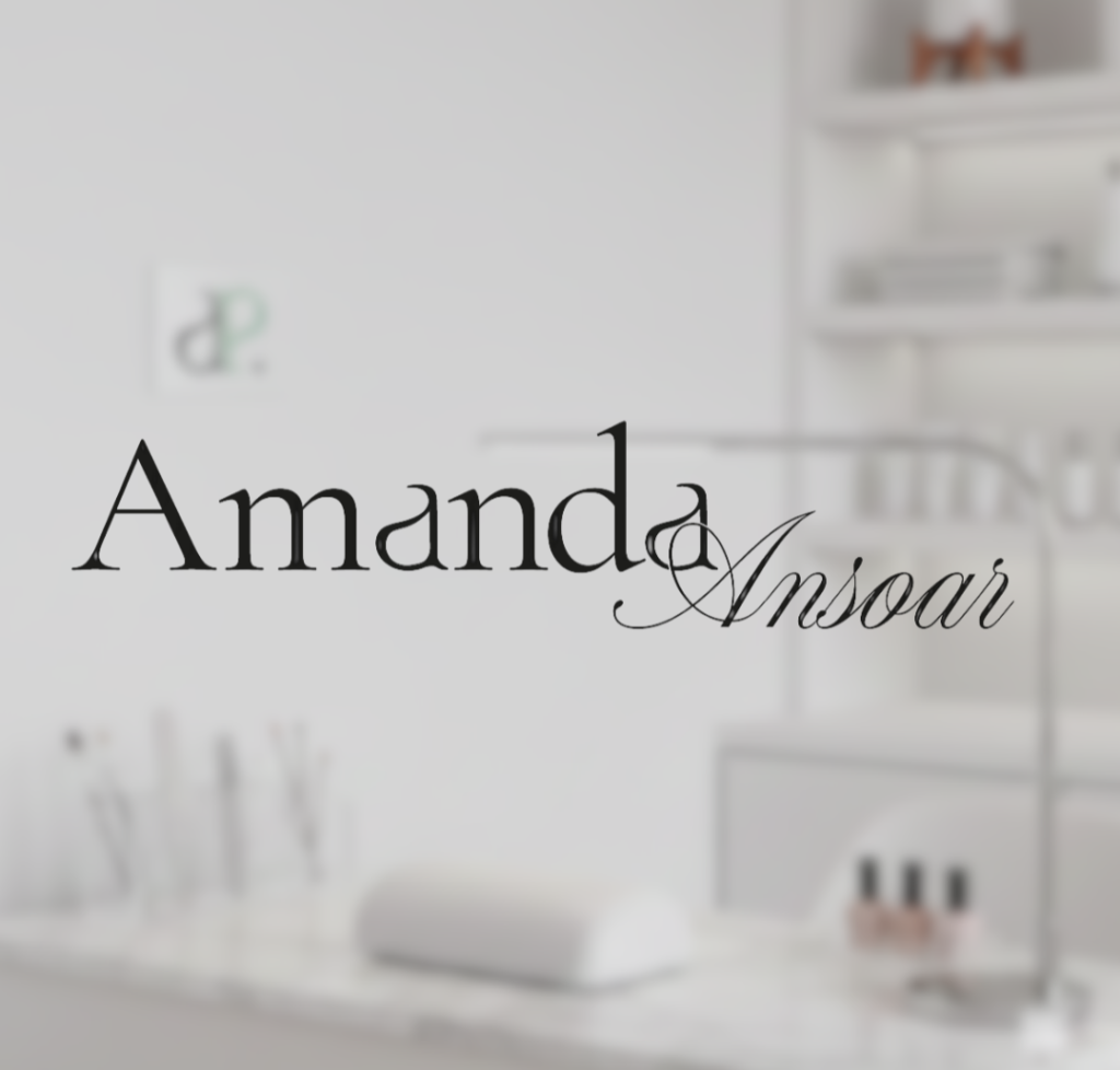
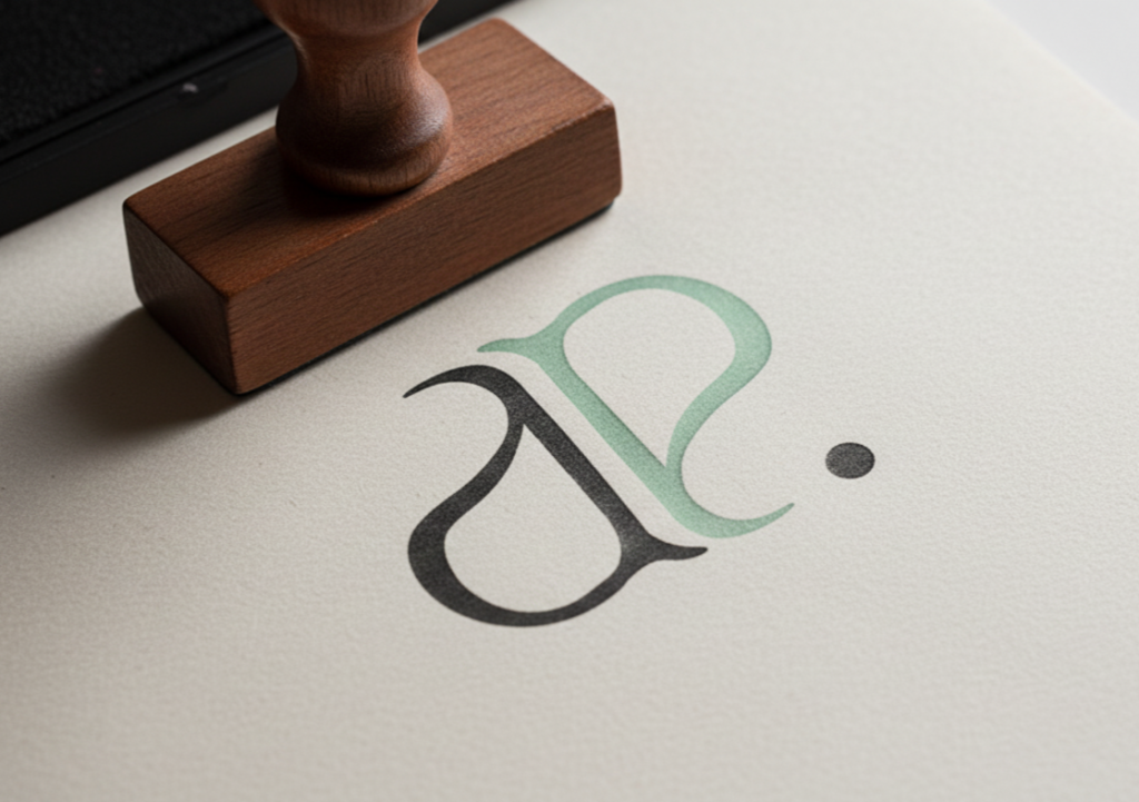
Amanda Ansonar’s identity is built on quiet elegance: delicate lines, subtle contrast, and a visual language that breathes. A characterful logo acts as a signature, while the monogram works as a seal—perfect for patterns, labels, and small applications. The palette moves between luminous neutrals and a soft accent that adds freshness, evoking cleanliness, skin, and wellbeing. In print and packaging, tactile finishes (cotton paper, discreet embossing, spot varnish) reinforce the feeling of detail-driven care. Because at Amanda Ansonar, each appointment is more than pretty nails—it’s a moment of precision, calm, and style you can see in your hands.