to the riot.
First time? No panic.
A messaging app
for shouting as a team.
RIOT is an internal communication tool for creative teams tired of corporate tone. Channels like #design-rants, quick reactions, and a constant invitation: stop scrolling, say something.
The identity translates that energy: starred typography, explosion-like monogram, high-contrast palette, direct composition. No decorative noise.
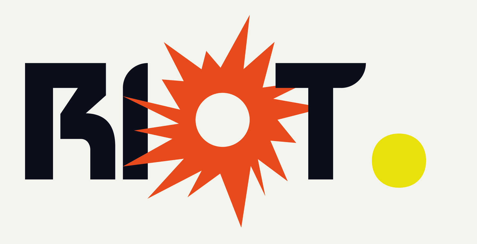
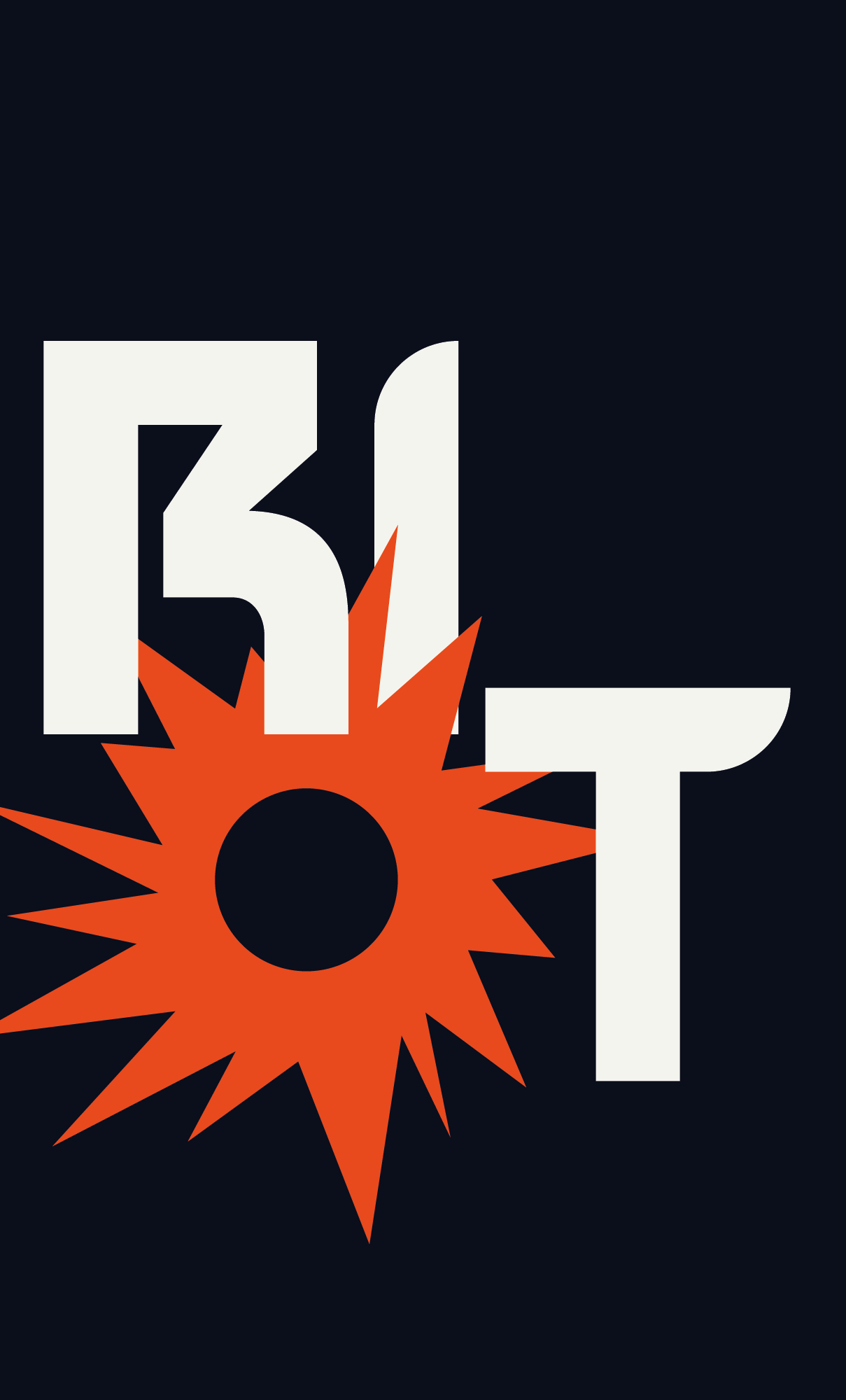
The O
explodes.
The RIOT. wordmark replaces the letter O with a burst monogram: the typographic tension point that gives the product its name. Built in Blockat, with variants for dark and light backgrounds.
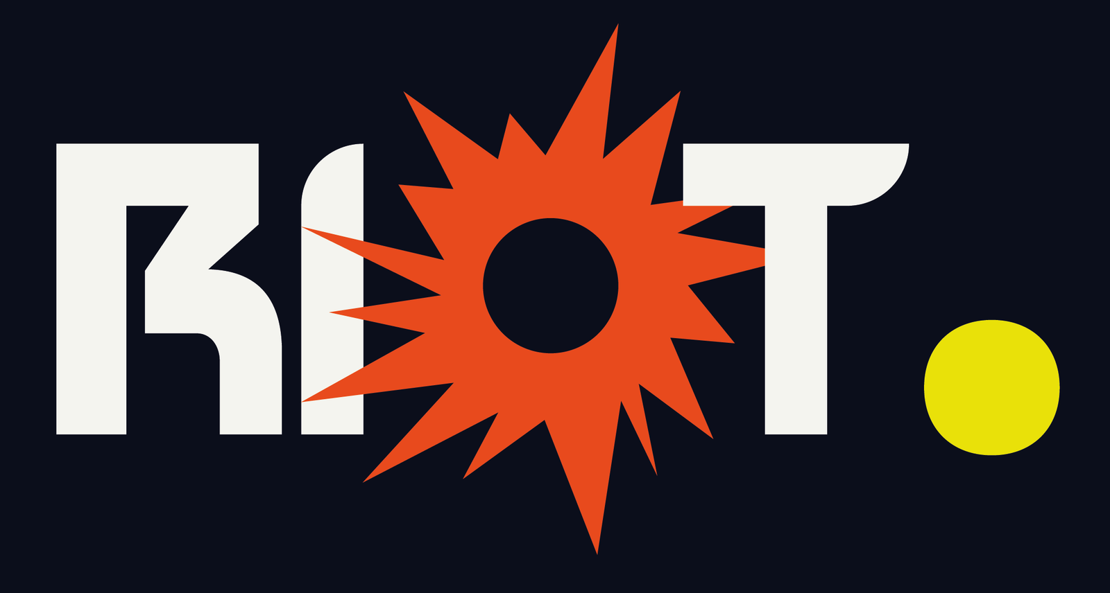
One logo,
two sides.
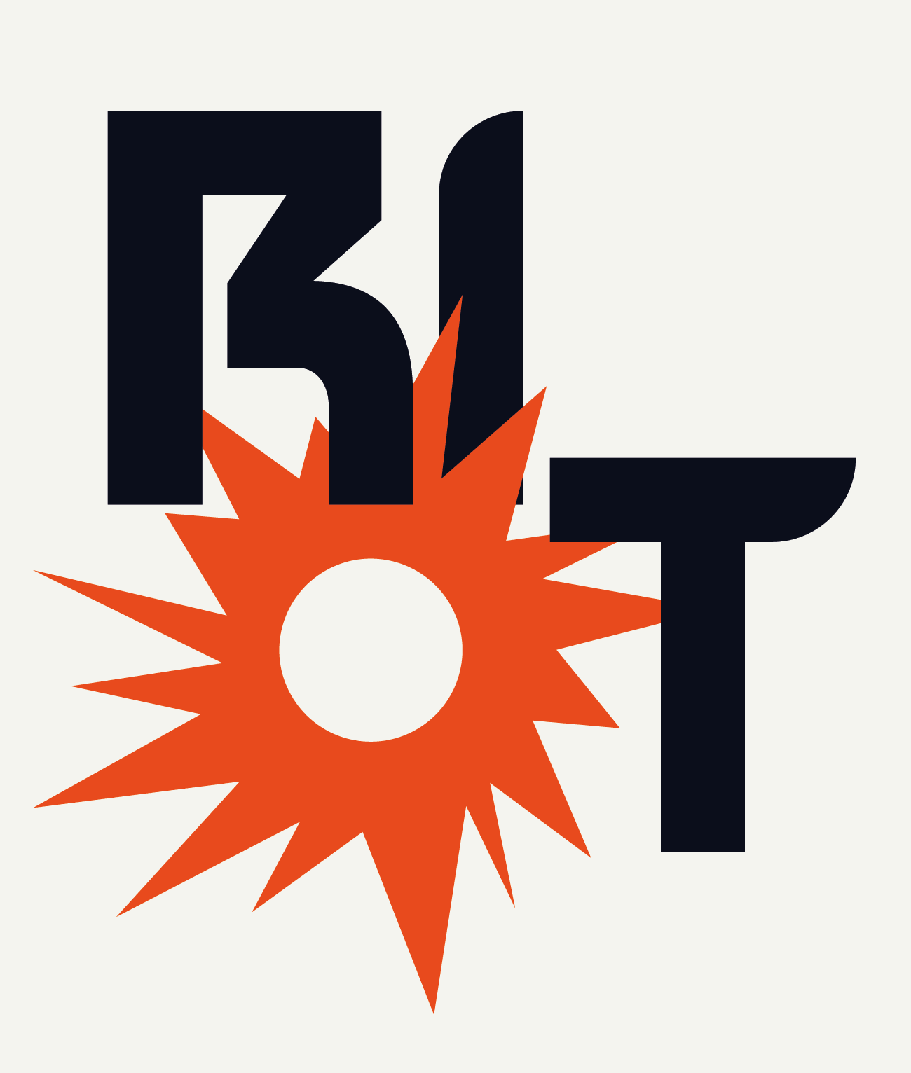
One-ink system for applications where colour isn’t an option: press, monochrome merchandising, engraving, stamping. Same energy, zero compromises.
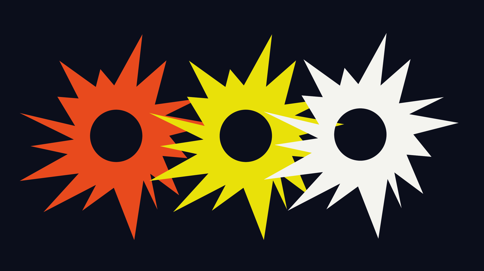
Three shouts,
one shape.
The isolated burst works as app icon, stamp, sticker and reaction silhouette. Three colour variants by context: orange (action), yellow (attention), cream (neutral).
The burst,
embossed.
Translation of the monogram to physical support with relief on leather. Merchandising, corporate notebook or stamp for the founding team — the form holds up to touch.
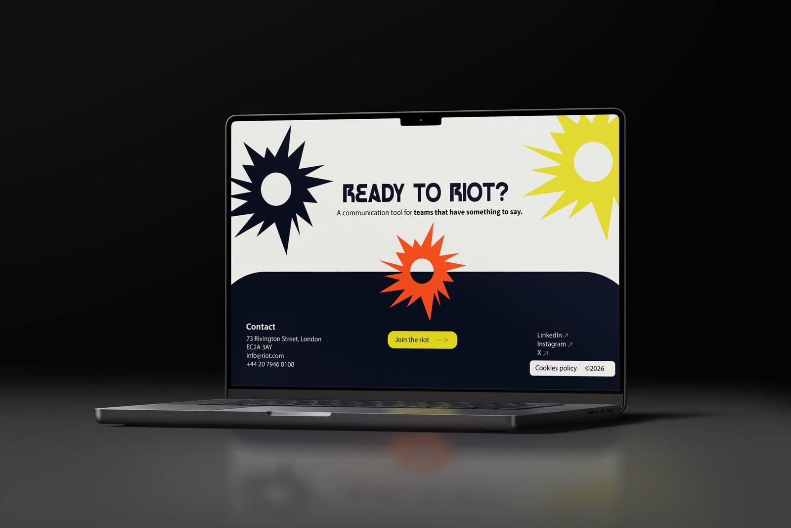
Four colours,
zero lukewarmness.
High-contrast palette. Navy anchors the voice, orange marks the accent, yellow grabs attention, cream breathes. Ratio 60 / 25 / 10 / 5.
Stop scrolling.
Start saying
SOMETHING.
Chat that
doesn’t apologise.
Interface designed for creative teams. Channels like #design-rants, quick statuses, reactions. The monogram lives inside the product as an active-room indicator.
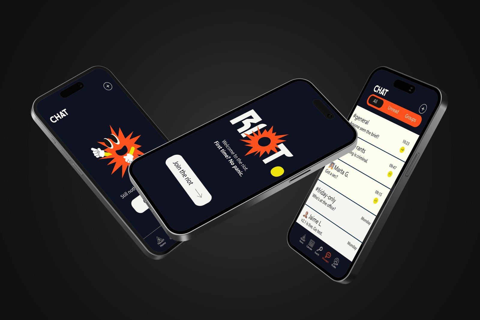
Loud channels
#general, #design-rants, #friday-only. Spaces that encourage opinion, not approval.
Burst reactions
The monogram is the reaction. One gesture replaces the “ok, got it”.
First time? No panic.
Onboarding with a direct tone. No 12-screen tutorials.
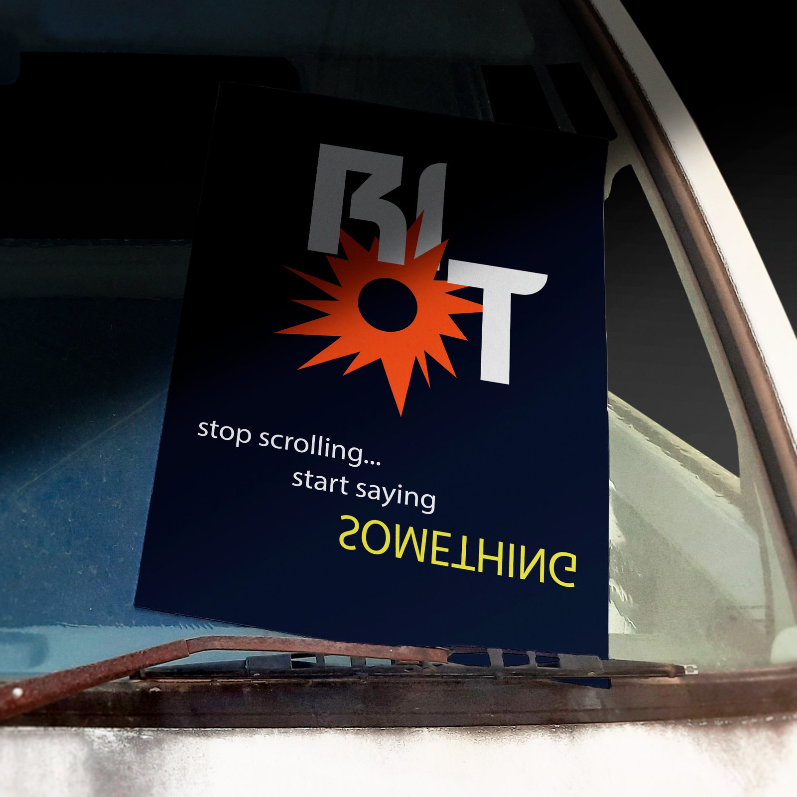
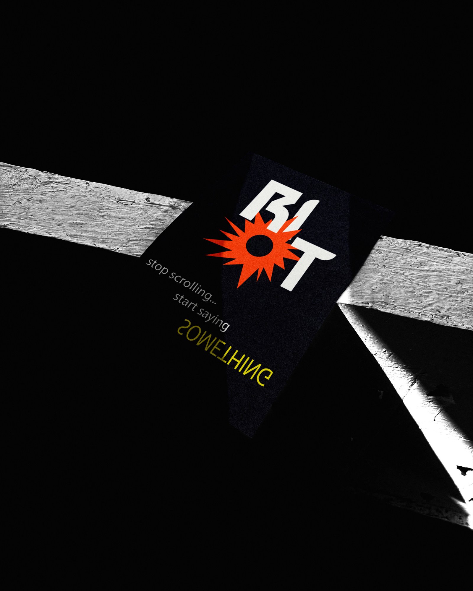
From feed
to the street.
Launch campaign in poster format. Inverted typography, central burst as visual anchor. The piece works as a call to action without an explicit logo — only tension.
A3 and A4 formats for urban wheatpaste and internal communication.
The monogram,
in volume.
Test translation of the monogram to tangible object. Stamp, internal trophy, merchandising or physical badge for the founding team.
Display that shouts.
Body that speaks.
Two families. One explodes, the other organises. No in-between ornament.
Join the RIOT.
Conceptual project for StudioCJ. This case study is fictional and explores a complete exercise in identity, digital product and print campaign.
Back to top →