Visual Identity
El Secano
Inland cuisine
A humble recipe, raised to three stars.
El Secano is a restaurant of Castilian dryland and inland-river cuisine. 24 seats in Chamberí, Madrid. It reclaims the forgotten cooking of inland Spain —game, river, vegetable garden, livestock— against the omnipresence of coastal cuisine.
Hare à la royale —what grandmothers used to call "hare with chocolate"— sums up the project in a single dish: humble in origin, elevated to the highest technique.
The identity builds that balance: culture without pretension, honesty without rusticity, warmth without folklore.
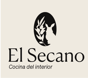
The Logo
The complete logo:
symbol and word.
A silhouette inside an oval —hare, olive branch and wheat— that condenses the universe of the dryland. Beside it, the name set in a contemporary serif.
The tagline "Inland cuisine" anchors the territorial concept and executes the serif/sans contrast that will define the whole identity.
Acid etching
The entrance speaks.
The symbol is etched onto the door glass using frosting and acid. No ink. No noise. Only presence.
A brand that is perceived before entering. A threshold that prepares you for the table.
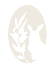
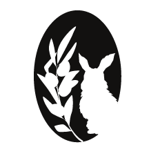
The Symbol
The hare and the wheat.
The symbol stands on its own, without typography. Three chromatic variants to adapt to any application.
On black
 On cream
On red
On cream
On red
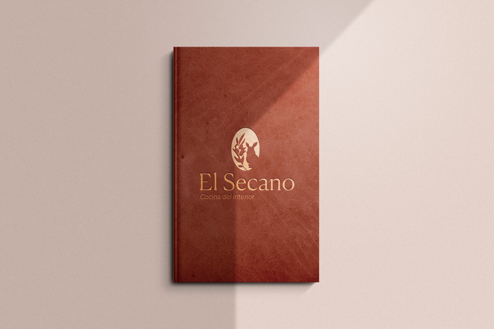
The Menu
Red leather and gold foil.
The menu is an object. Hand-bound in natural leather dyed in chestnut red, with the logo stamped in gold foil.
Designed to last for years, age beautifully and convey gastronomic culture from the very first gesture.
The Palette
Cream, black and chestnut.
— 60 / 30 / 10 rule.
Stationery
Embossing on textured paper.
Cards, envelopes and complementary material on raw paper with debossing finish: the brand is felt before it is seen.
Typography
Canela Deck and Söhne.
Conceptual project. This case study is fictional and has been developed as a creative exercise.